New Media Production
This class focused on the principles of web design and structure. We began with HTML and CSS and I created my first website using these new skills. Then, we moved to Bootstrap and I was able to create a much more thorough website, using these new themes. From there, we learned how to navigate WordPress and JavaScript. This class was challenging, yet proved to be extremely rewarding, with each learned skill revealing tangible results.
New Media Production:
HTML & CSS
Project One
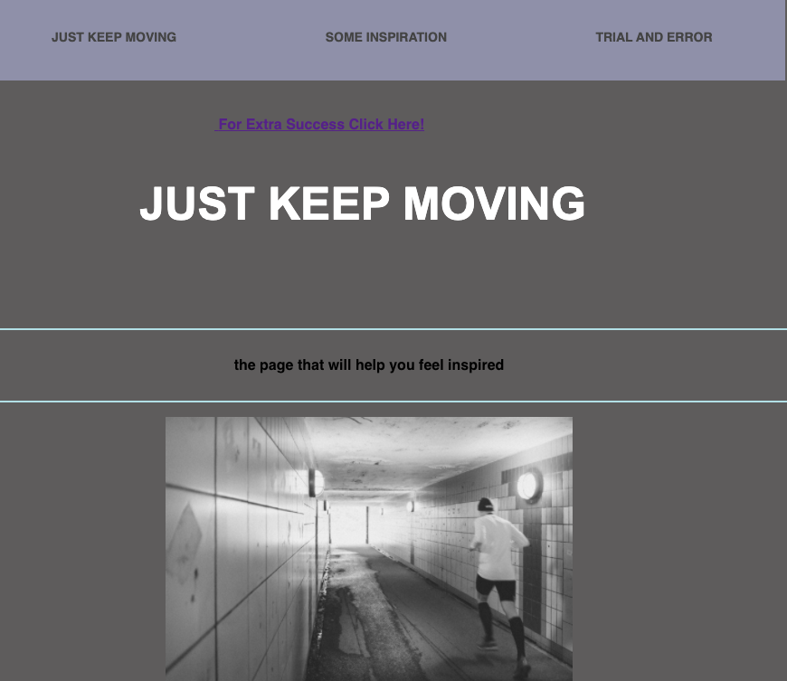
This project gave me a newfound appreciation for technology and the Internet. There is so much detail embedded within each click of the button. At first, I was apprehensive about the process and discovered that before I could truly enjoy HTML, it was necessary that I played around with and became familiar with the basics first. I definitely ran into a few bumps along the way. The biggest challenge for me was the navigation bar. It, although not perfect, became something that I was really proud of. It has a nice color and I was able to figure out how to hold it at the top in a “fixed position.”
Since I have never used HTML before, every inch of this project became a new skill. My favorite would have to be the ability to embed links to other websites within your own. I added little links throughout for extra practice! With more time, I hope to become more adept at setting the CSS up in a more comprehensive way, as well as using colors and fonts to create a more visually appealing look.
New Media Production:
Bootstrap
Project Two: Panel One
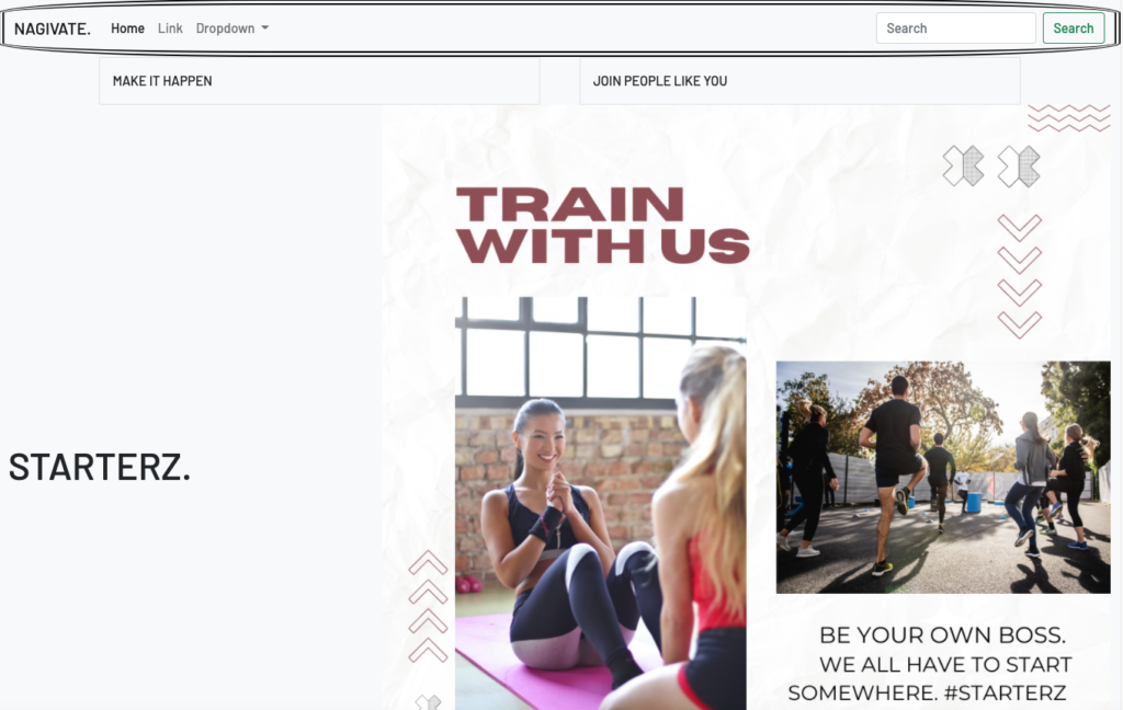
Bootstrap was initially quite daunting as I attempted to wrap my head around grids and bundles. Once I sat down with a determination to learn it, I was able to see some progress. It was definitely a learning process. I began to better understand the usefulness of bootstrap and how much I could accomplish with it. While creating this panel, I made an effort to pay special attention to the details. I tried to stick with a more neutral color scheme and apply it strategically throughout. Making the first image was a great accomplishment of mine; it required creativity and generous thought behind what I wanted to portray. This was a challenging task because I couldn’t make it both compact and responsive at first. I am overall proud of how this panel turned out.
New Media Production:
Bootstrap
Project Two: Panel Two
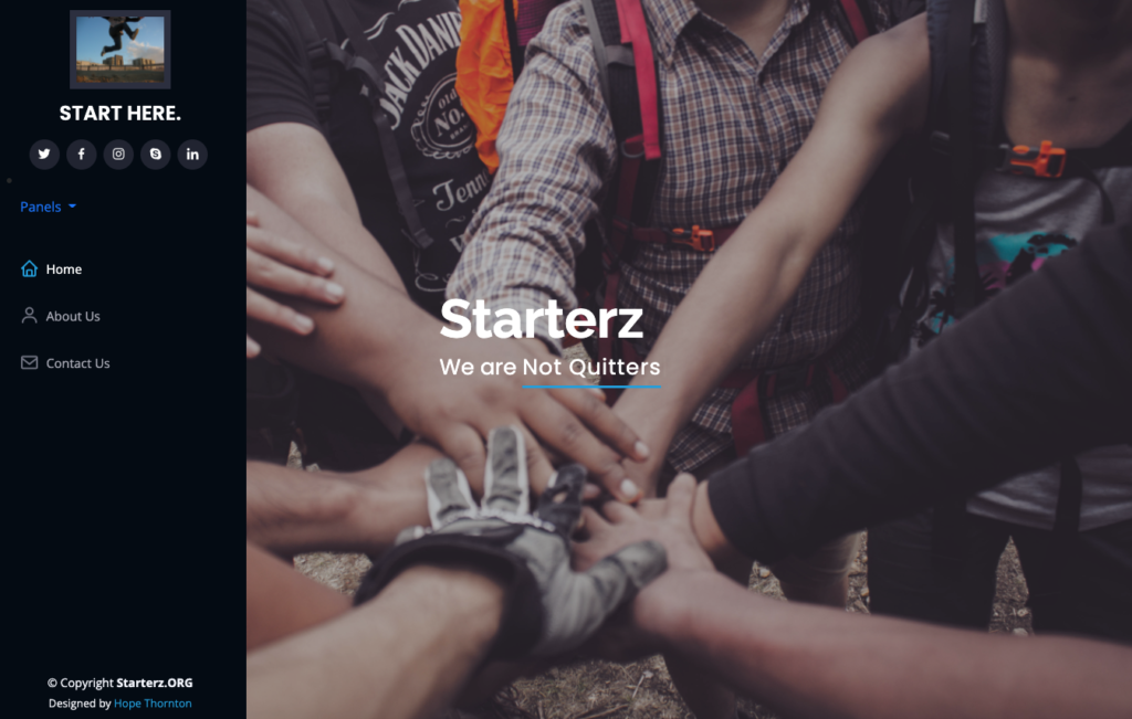
Although the second panel should have been the easiest panel to make, this was by far the most challenging area of work for me. It took a while to figure out just how I wanted everything to be written out. The inability to change the CSS was the most difficult feature of this panel. When I was finished, I noticed the color scheme was not how I would have liked it, and certain elements, required improvement. The process of creating this panel taught me the value of taking the time to style my websites. The “Start Here” sections on Panels One and Two link back to the original homepage. I did this so that the “Start” is just my homepage’s humble beginnings.
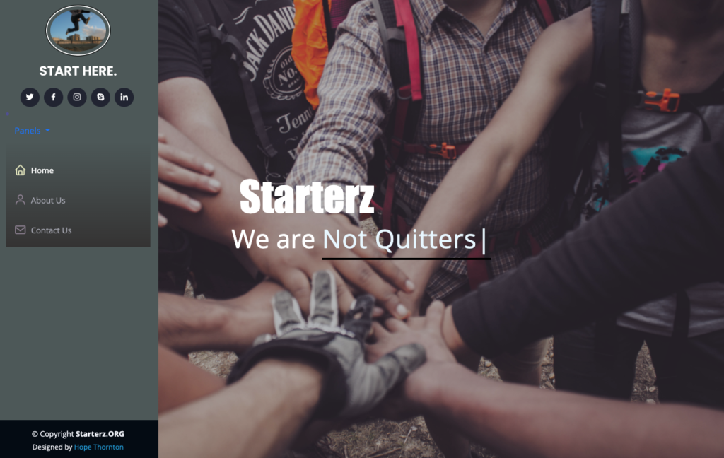
New Media Production:
Bootstrap
Project Two: Panel Three
I am quite pleased with panel three because it challenged me and pushed me to try new things. At first, it was difficult to astern each CSS element from their counterparts. Aspects such as color gradients and schemes were important to utilize and change on the page to add contrast and make it differ from the Bootstrap theme. Furthermore, I thought it may be a nice touch to have my name link to my actual LinkedIn page. I thought it may be more aesthetically pleasing to have the “Start Here” image to be circular instead of the original square. I felt that it may feel more inviting. The colors became fun to mess with and see which ones worked with each other. I am thankful that this project allowed me to tap into a creative side!
New Media Production:
E-Commerce
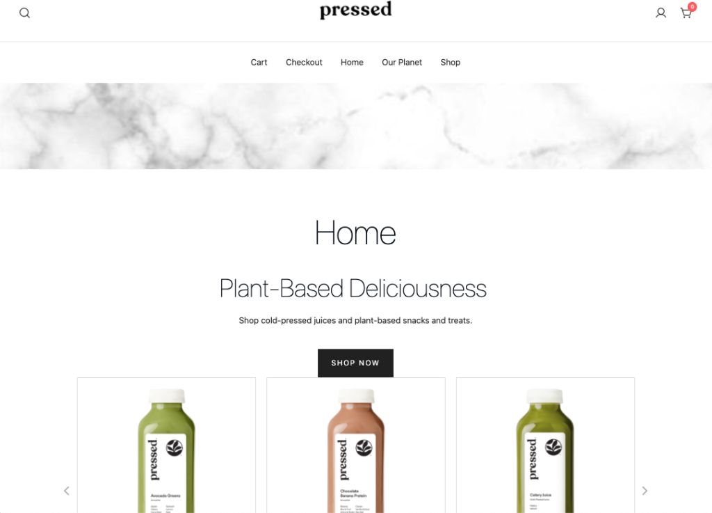
Project Three: E-Commerce
This project was incredible. I am so thankful that this class has forced me to adapt and overcome, time and time again. I am far from perfect, but I truly was able to see how making mistakes will help you learn. I experienced challenges in wordpress, just as I had originally experienced for HTML. When I originally created the websites, I had accidentally uploaded woo-commerce to my news site instead of the commerce! So, I had to backtrack and flip things around. Then, I was quite puzzled as to how I should begin. I had picked a theme, yet I struggled with figuring out how to put it all together using widgets and blocks. After I had played around for a while, I noticed how important it was to check my work using “preview,” just as it was for saving my work in visual studio code. In my commerce website, I tried to stay on par with the “simplicity” theme, using neutral and white colors. I played with the heading customizations and extra CSS to create thin black lettering and an easy to use, sticky bar to make navigation easy. I added another page called Our Planet. I thought this was a nice touch to the website because it shows the authenticity of the product and tells a story. I used a variety of different blocks throughout, including a button that navigates the viewer to a sustainability website, offering ways to help out the earth. This was in hopes to show the viewer that “Pressed” is not just any commercial site, and one that truly cares about more than just its product. For the product comments, I found a way to change it from saying “admin” to the actual names of the customers. I thought this added a personal touch to the message. Needless to say, it was hilarious choosing which comments I would include on the site and how I wanted them to appear. In the design of the shop and home pages, I made sure to pay special attention to detail. I created collages, designed carousels of just the showcased ingredients, and finally designed something that I was proud of.
New Media Production:
News
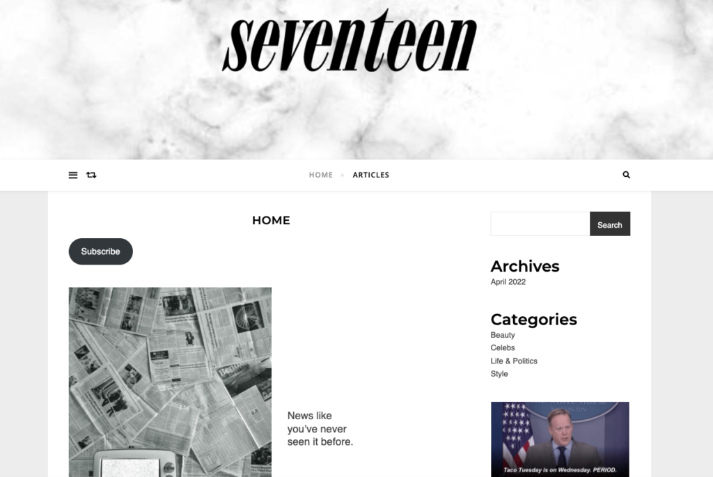
Project Three: News
The news website was the first site that I had fully finished on wordpress, so it holds a close place in my heart (haha)! I actually had originally begun with a totally different news site to mimic, yet realized I wasn’t enjoying it. It was mostly just politics and totally boring news. So, upon doing some research, I chose to focus on a more pop-teen, less serious side of the news. I found a way to add a funny GIF and categories that I was personally interested in, as well as some important news. I spent a lot of time assessing the aesthetic of the home page and changing around side bars, type fonts/colors, and adding words that, when clicked on, would lead to my news articles. Honestly, one of the most exciting things that I accomplished, even though menial, was the “seventeen” logo in the header! I went to great lengths to erase the background of the words so that it would show up without a white background on the marble. In the articles, I got a bit carried away and ended up pretty much fully “flushing out” each site. It was very time consuming saving and adding each of the pictures and creating clickable instagram, twitter, and facebook images, yet I was very pleased with the outcome. With more practice, I think that wordpress could really become a friend of mine!
This project was incredible. I am so thankful that this class has forced me to adapt and overcome, time and time again. I am far from perfect, but I truly was able to see how making mistakes will help you learn. I experienced challenges in wordpress, just as I had originally experienced for HTML. When I originally created the websites, I had accidentally uploaded woo-commerce to my news site instead of the commerce! So, I had to backtrack and flip things around. Then, I was quite puzzled as to how I should begin. I had picked a theme, yet I struggled with figuring out how to put it all together using widgets and blocks. After I had played around for a while, I noticed how important it was to check my work using “preview,” just as it was for saving my work in visual studio code. In my commerce website, I tried to stay on par with the “simplicity” theme, using neutral and white colors. I played with the heading customizations and extra CSS to create thin black lettering and an easy to use, sticky bar to make navigation easy. I added another page called Our Planet. I thought this was a nice touch to the website because it shows the authenticity of the product and tells a story. I used a variety of different blocks throughout, including a button that navigates the viewer to a sustainability website, offering ways to help out the earth. This was in hopes to show the viewer that “Pressed” is not just any commercial site, and one that truly cares about more than just its product. For the product comments, I found a way to change it from saying “admin” to the actual names of the customers. I thought this added a personal touch to the message. Needless to say, it was hilarious choosing which comments I would include on the site and how I wanted them to appear. In the design of the shop and home pages, I made sure to pay special attention to detail. I created collages, designed carousels of just the showcased ingredients, and finally designed something that I was proud of.
New Media Production:
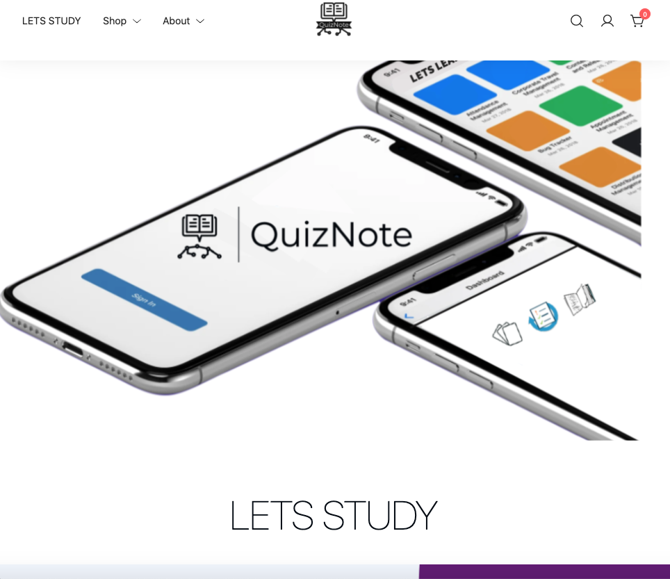
Final Project: Publication-style CMS Mastery
This was certainly one of the most exciting projects for me this semester because of the creative freedom. I had originally chosen the option to redesign a website. One weekend, I was with my friends and told them about a random idea for an app that I had. But I didn’t stop there. Using my skills from this semester, that Saturday I went home and created a basic yet fully functioning E-Commerce website based on this idea.
I was thrilled. Naturally, come Monday morning, I had to show my friend Isa the website. She suggested vamping up this website for this project and I couldn’t agree more. I deleted the other website I was building and got to work on something that I was proud of.
Click HERE to see the steps involved!
LINK to website.